1976-1977: Jon era
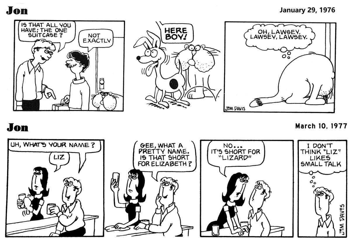
Jon was Garfield before Garfield, basically the version of the comic before it was syndicated. It focused more on Jon before Jim Davis realized Garfield was a better protagonist. I'm not the biggest fan of these, mostly because they've... Aged. They were made in the 70s and it shows. Anyway. The 1976 style looks a bit weird, Jon looks a bit like a Muppet in my opinion. You can see how the 1977 version made some changes, and it already looked more like the Garfield style from the first syndicated strips that were soon to come. I like the oval eyes. As for the animal characters, their designs suck. Odie (or Spot, as he was known in this time) looks more like a chihuahua, and Garfield looks weird. (What's up with his tail?) He has no stripes either. I give this style a 4/10.
1978
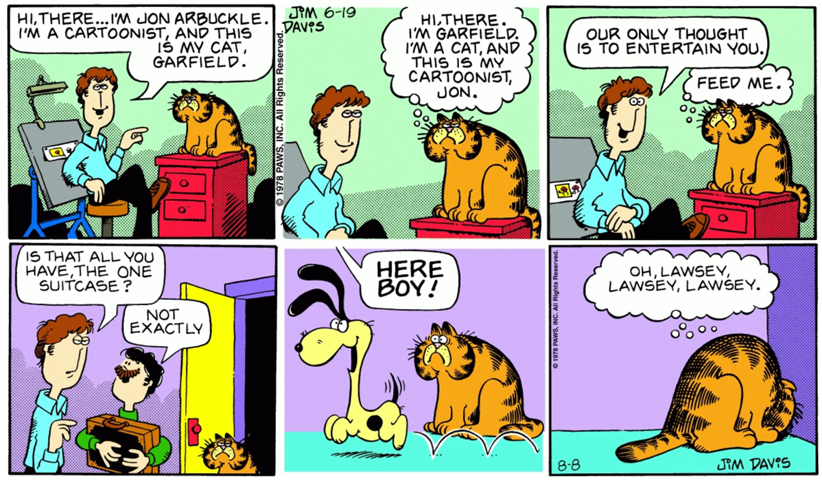
Now this is the version of Garfield we're all familiar with, well, kinda. As you can see, Garfield still looks very different from his modern counterpart, but at least he has his iconic stripes and yellow mouth now. Odie has black ears despite the full range of colors. And as for the human designs, you can see they look a lot like the 1977 version of Jon. They have long, almost squarish faces and small eyes. I think this style is nice, Garfield looks kinda funny but I think everyone else looks okay. I give it a 7/10.
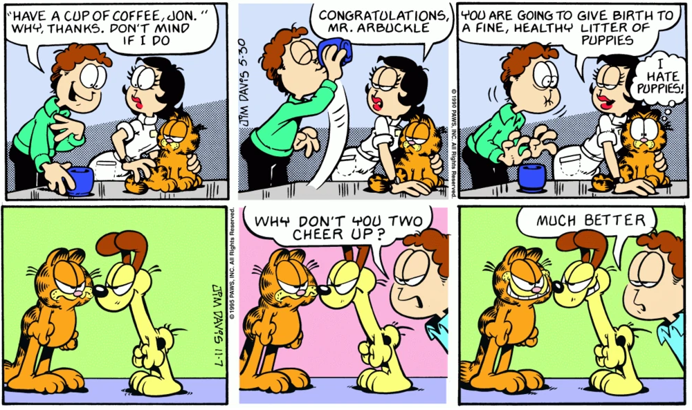
1979-80s
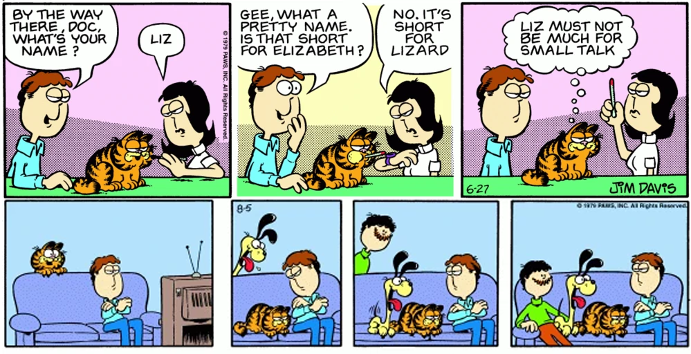
As you can see, a significant stylistic change took place in '79. Garfield now has his more recognizable body shape, Odie got his brown ears in 1980, and the human characters look a bit rounder, and their eyes are starting to get bigger. Liz was also re-introduced this year, this time as a vet instead of a waitress. Good for her. The human characters' bodies look kinda funny, like they didn't quite know how to draw them yet. Not many significant changes were made until the mid-80s when Garfield started walking on two feet. bUt as for art style changes, I didn't think they were significant enough to merit their own category. 9/10. I do like the long faces from '78 a bit better, but this is my favorite Garfield design (and also my favorite era of Garfield comics in general)
90s
Their eyes just keep getting bigger! And Garfield's body shape also changed. His ears are bigger and his legs are longer. He just looks rounder overall, not in a realistic cat way, like in a literal "he looks like a circle" way. Odie's neck has always been long, but as you can see his neck is thicker. They finally nailed the human characters' bodies. too. This is definitely a turning point for the Garfield comic, because this is probably the most recognizable art style. I think it's good, and definitely iconic, but I like the older styles a bit more. That being said, 8/10 for how iconic it is.
2000s-early 2010s
This is the era where the text started being digitally added, and later in 2010 the entire strip would start to be drawn digitally. I think it looks good, they kept the lineweight very similar to the older strips which I appreciate. I miss the softer background colors from the 90s though, and they mostly stopped using screentones here, which makes me sad because I LOVE screentones. They're neat. (You can see hatching being used instead in the example I've provided for example). 5/10, not bad, not great. Not much to say about it. Their eyes keep on getting bigger.
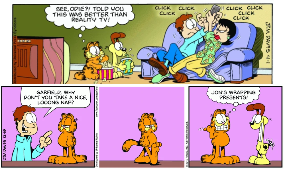
Mid 2010s
I don't like the gradient backgrounds :( Also is it just me, or do the eyes look even bigger now? Also the colors are waaaay too saturated. But idk, that's just my opinion. They seem to finally have a consistent art style for everyone, and honestly I don't see it changing from here. Maybe in 2078 when I'm old and decrepit and Garfield proudly celebrates its 100th anniversary the characters' eyes will take up 95% of their faces. Also can we talk about Liz's lips? Because they look kinda weird. They've gotten so much bigger over the years and it's just weird to look at. Like her bottom lip goes past her chin. And they're so glossy. I wanna pop them like a balloon. Anyway. Where was I. 3/10 I hate the gradient backgrounds.
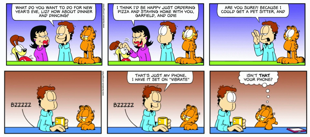
2020s
Idk. While I'm glad they went back to the solid colored backgrounds, the colors are way more muted, and I know I just complained about the overly saturated colors in the previous era, but this is waaay too much desaturation in my opinion: They should look for a balance. And the lineart style kinda changed as well. I can't explain it, but I think it may have something to do with the lineweight. Idk, these small changes were worth pointing out though because they definitely give the strip a different vibe. I also miss the screentones. I like how Garfield looks though, even if not much has changed about him. 4/10 just for the muted colors. They bother me.